Originally published at: Best Order Flow Indicators To Spot Buying and Selling Pressure
This article on Best Order Flow Indicators is the opinion of Optimus Futures.

-
What Indicators should you consider when reading Order Flow?
-
How do you identify the big player’s trades?
-
How to add VWAP to your market analysis
When we trade a financial asset, we often rely on charts to identify market opportunities. We identify patterns that might give us a better sense as to where price might be heading. Our charts are like “maps,” indicating potential headwinds, tailwinds, critical levels, and turning points.
On every chart, price and time tend to be the dominant features. Indicators, though important, are variable and supplemental. Although “volume” is sometimes treated as just another “indicator,” what many traders miss is that the combination of price, time, and volume can reveal something far more important than any of those three factors alone: the driving force behind the market .
Price, Time, and Volume Drive Order Flow
Price movements within a given time period mean nothing unless you can see the volume driving it. The volume of trades cannot signal direction unless you look at the price context in relation to time. The significance of time in trading is best defined by the volume that drives prices. They are all intertwined.
So, putting all three elements together, you get a clearer picture of buying and selling pressure –the factors that drive the order flow behind price movements.
Now, the question is, “what tools might you use to better detect and, most importantly, interpret buying and selling pressure?”. We are going to discuss the seven best order flow indicators that might be useful, particularly for short-term trading scenarios.
We will provide a simple introduction for each one, providing a lengthier “how to” post in the following weeks. If you want to try the indicators yourself, they are all available in the Optimus Flow platform.
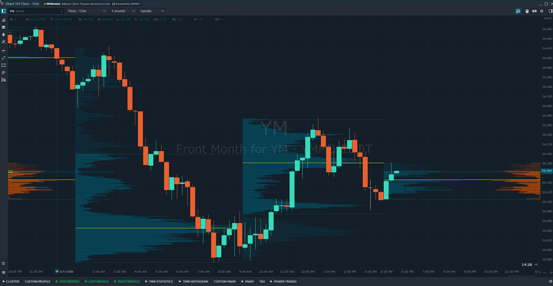
1 – Power Trade Scanner
Imagine a moment in which there are more buyers than sellers looking to transact the same (or similar) product. Chances are that the price of whatever is being bought/sold will go up. More buyers than sellers can often mean that the item being transacted may be bid-up, as buyers compete for the item, and sellers increase their asking price to get a better profit. The reverse is true when sellers outnumber buyers.
Now, if a large amount of purchases or sales takes place within a short period of time , then it’s probably telling you that there’s momentum behind the buy or sell side of the market. It all depends on who is outnumbering who (buyers or sellers). That momentum might also indicate a near-term likelihood that price may move up or down, a key insight for any trader.
But how might you know when a large execution takes place within a short period of time? Most volume analysis tools are not designed to analyze this phenomenon. Well, that is the idea behind the Power Trade Scanner .
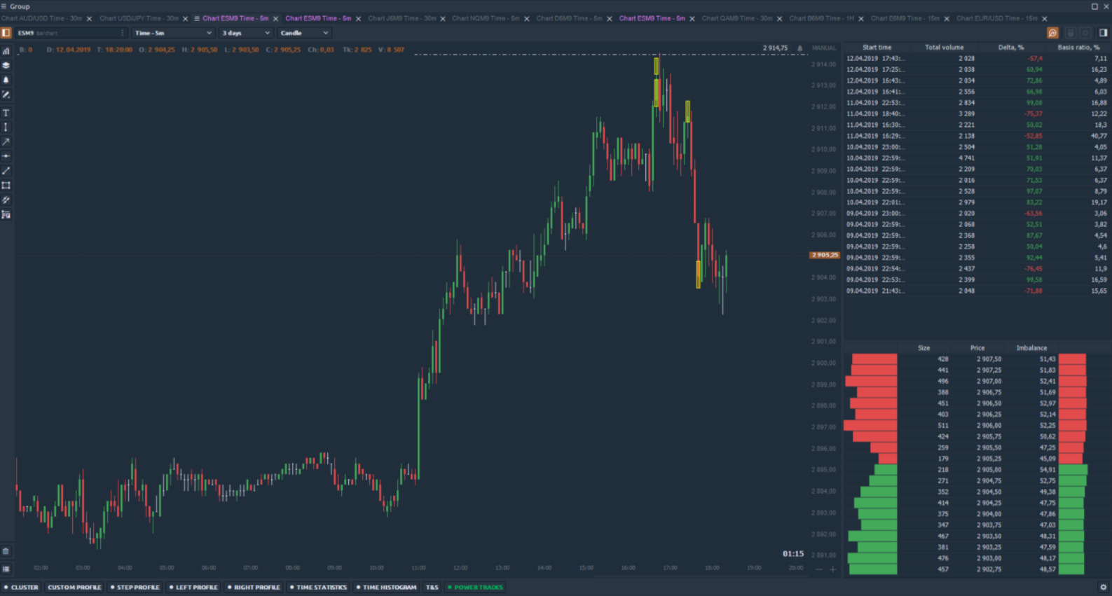
Source: Optimus Flow
As shown in the image above, the yellow highlighted sections pinpoint large order executions that take place within a very short time span (like 3 seconds, or however you might want to customize it). By allowing you to see these short moments of high-volume trading, you are able to gain insight into probable near-term price directionality .
2 – VWAP Indicator
Have you ever wanted to trade alongside large financial institutions such as mutual funds, hedge funds, and other large investors? Well, the VWAP indicator is one tool that can potentially get you on the same side as the bigger players on Wall Street.
VWAP stands for Volume Weighted Average Price. It’s a mouthful, but this indicator shows you the “average price” of a security based on both volume and price. Now, why is this so important to institutional traders? When large funds need to buy or sell assets, they often do so in huge amounts.
The last thing most of them want to do is move the markets in the process of buying or selling, as that would obscure prices, making it difficult for them to complete their transaction.
To help prevent this from happening, they will often buy when the asset price is below the average price and sell when the asset price is above the average price. And to determine where asset prices are relative to average prices, many of these funds use the VWAP indicator as a tactical tool to assist them in their transaction.
As a trader, you can also use it to increase the odds that you might end up trading with and not against the larger funds.
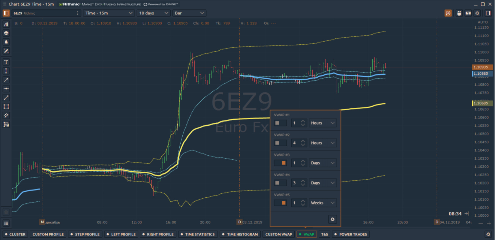
Source: Optimus Flow
As shown in the image above, you can overlay different VWAP levels to get a picture of different average price levels based on time frame.
If you’re using VWAP levels as price targets, you can use support and resistance as entry levels, or you can use any standard deviation-based indicator (as shown below) to help determine entry based on when you think price may revert back to its average price.
Source: Optimus Flow
Caveat: VWAP can be applied to different time periods. So, if you’re trying to increase your chances of not trading against larger institutions, note that some firms may be using shorter-term time periods while others may be using longer-term periods.
In short, VWAP is no guarantee that you’ll be avoiding a “whale”, but it does give you some insight as to where these whales might be spotted.
Customizing Your VWAP Strategy
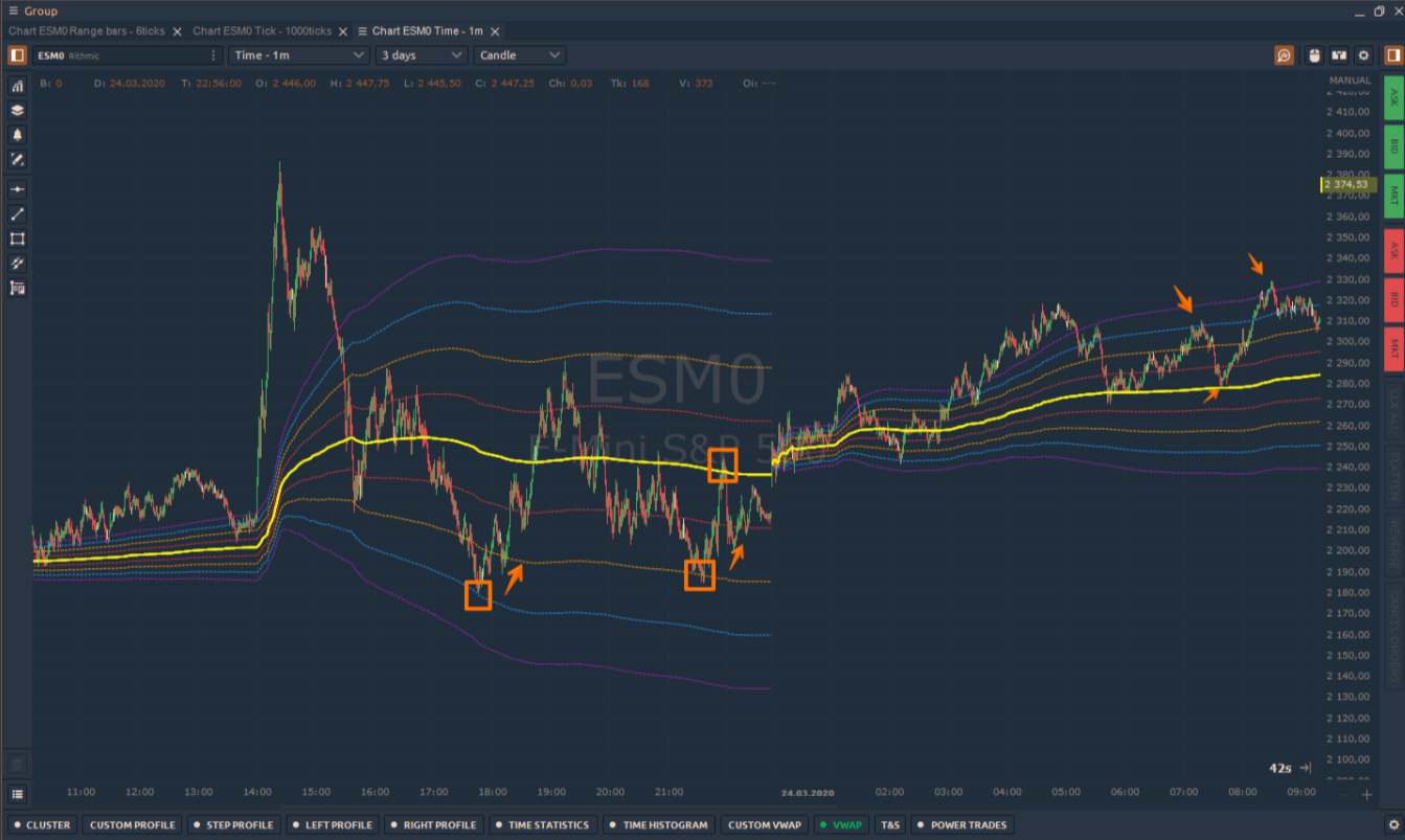
You can customize your VWAP indicator to a specific period of time.
Source: Optimus Flow
In the example above, I narrowed my time frame to just a few hours of trading. As I demonstrated, you can use the customized VWAP as a tactical tool to analyze average prices within a preferred time frame. However, if you are trying to analyze average prices alongside institutional players, bear in mind that they may not be using the same time frame as you.
So although traders use VWAP to increase their odds of trading with the bigger players, just remember that customizing your VWAP will put the analytical context strictly within your own preferences, which can be useful when personalizing your strategy.
3 – Volume Profiles
Let’s take a step back for a moment and think of a familiar non-market scenario. Let’s think about our local geographical areas. There are certain places people frequent. Grocery stores, restaurants, and other social areas.
Categorically, there are certain stores or restaurants that people flock to more than others. On a larger scale, there are certain areas in the country that experience larger amounts of travel than others.
This volume of traffic tells you something. Obviously, people frequent these areas for a reason. These high-traffic areas hold a degree of importance that either attracts people or makes them come back (for one reason or another). When it comes to price levels, a similar principle applies.
Pioneered by J. Peter Steidlmayer, the Market Profile chart aimed to analyze price activity as it evolved throughout the trading day. There’s a lot to market profile charts, and we can’t even begin to discuss it here. But one simple way to look at it is to note areas with the largest horizontal lines. Those lines represent the amount of trading activity at a given price level.
Source: Optimus Flow
As traders collectively go through the motions of “price discovery,” there are certain price levels at which buyers and sellers might agree on, in terms of a temporary “equilibrium” in value. These are called “value areas,” and they are often the most frequented levels.
Value areas will change from day to day as the market digests new information. Value areas will also take different shapes and forms depending on the price discovery process.
As you trade with a given Profile, you have to interpret what these trading areas mean, and whether they might indicate support and resistance, breakout levels, or price targets.
And with Optimus Flow, you can customize your Volume Profiles by analyzing different time frames, or even place multiple profiles at once–setting one at the center, left, and right of your chart. We will cover the details of this fascinating indicator in a later post.
4 – Time and Sales Window
Ever wondered what old fashioned ticker tape reading was like? Well, the Time and Sales window is probably the closest you will get to it. Not so much an indicator as a historical record of trades, time and sales displays all trades for a given instrument, detailing price, quantity, date, and time.
Unlike the past, where trades were dispensed in a seamless row of tape printouts, today’s digitally powered trades hold much more volume and speed, especially in real-time, where the data flows like a ticker tape on steroids. Nevertheless, time and sales data can be a treasure trove for those who know what to look out for.
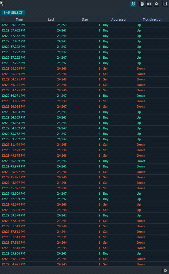
Source: Optimus Flow
So, what’s the point of reading Time and Sales ? Similar to the Power Trades scanner, you are looking for aggressive trades that might indicate stronger buying or selling pressure. Except, unlike Power Trades, you are sifting through all of the trade data by sight.
Tape reading is no easy task, and it is a skill that takes practice. But if you can master it, you might have an edge over other traders who are unfamiliar with this long-forgotten practice. You have to admit, it’s pretty “old school”.
5 – Time Statistics
The Time Statistics window gives you a suite of detailed volume information on a per-bar or per-candle basis. What was the volume in that last bar? How many buy trades versus sell trades were there? How did that affect market price?
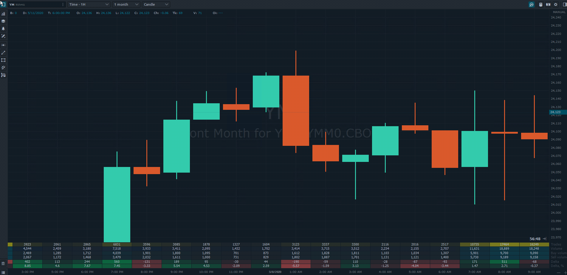
Source: Optimus Flow
These are all questions that the stats data can answer. It is like another way of monitoring the Time and Sales. But instead of following a running history of trades, you can see the data evolve as each bar forms.
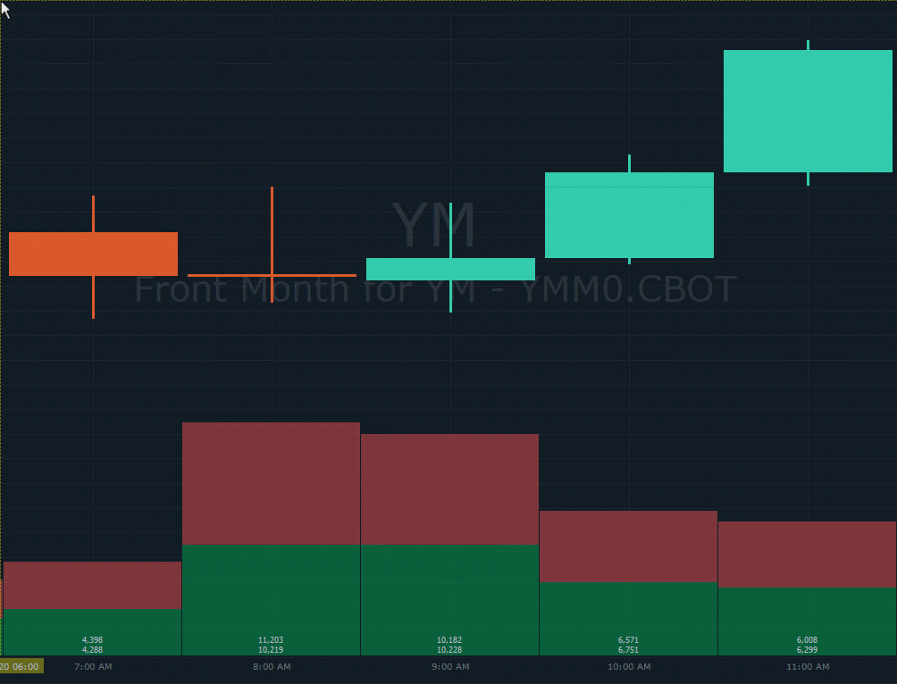
6 – Time Histogram
The most common histogram that we are used to seeing, possibly because every chart has it, is a volume histogram.
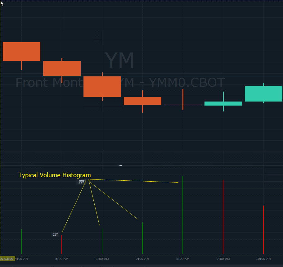
Source: Optimus Flow
Volume histograms are quite useful as they provide a relatively clear picture of volume trends (or lack of) and buying/selling pressure. But what if you wanted more information?
For instance, what if you wanted to know the total volume, buy or sell volume, buy and sell volume, average buy or sell side, or what if you wanted to filter your volume information? Getting this level of detailed information is what makes Optimus Flow’s Time Histogram very useful, as you have a list of data choices you can display on your screen.
Source: Optimus Flow
For instance, here is a Time Histogram displaying buying/selling volume. Again, this is just one set of data that can be displayed in a histogram format. Depending on the kind of data you choose to see, you can customize the histogram’s settings to analyze historical trading activity or to forecast potential turning points in the market.
7 – Cluster Chart
Also known as a “footprints” chart, the Cluster Chart allows you to get an in-depth view into what is going on inside a candle. What is the order flow like in terms of total trades, buy or sell trades only, trading volume, etc.? There are several different settings you can use to filter the candle information.
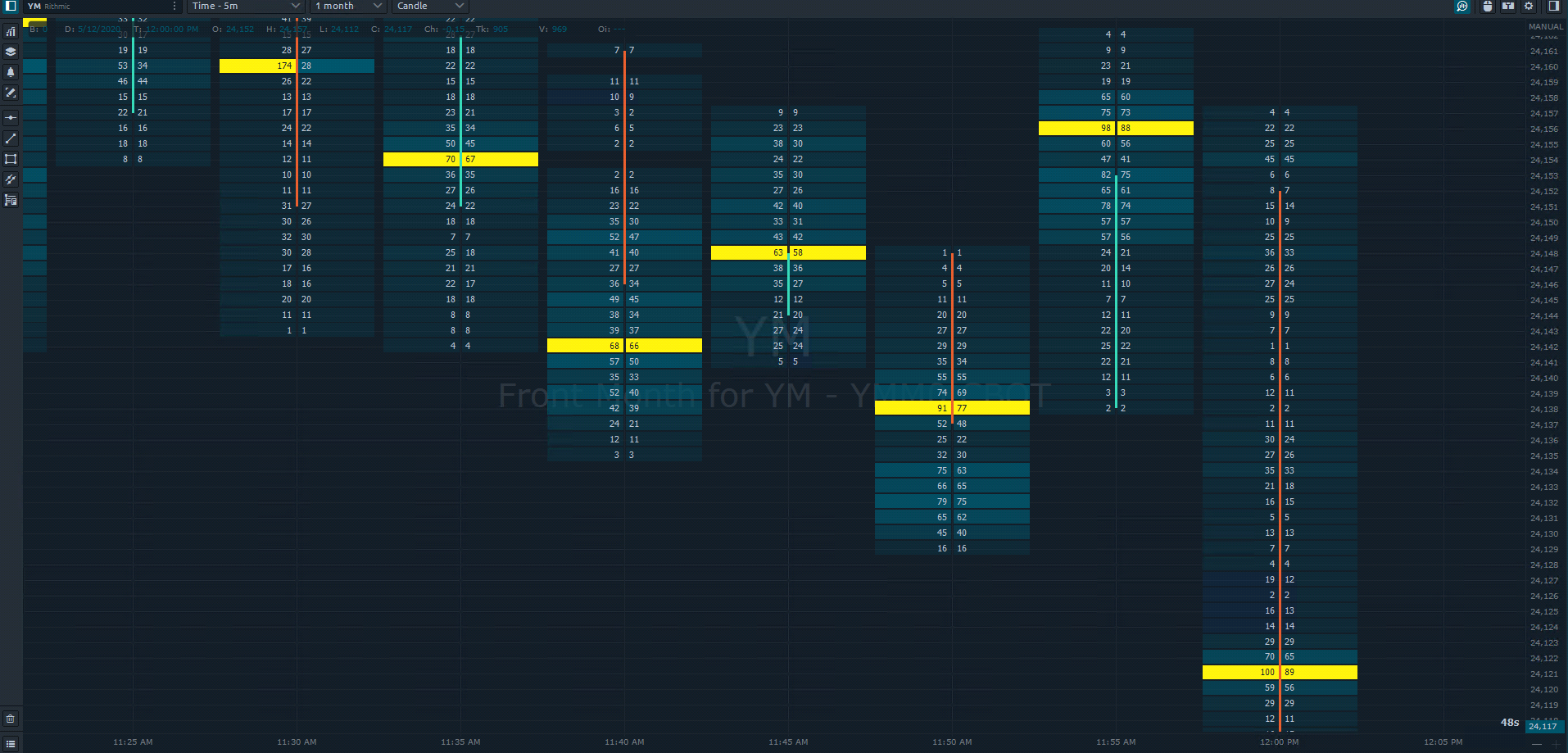
Source: Optimus Flow
Why use the Cluster Chart? So, you can get insight into zones of maximum buying or selling, zones of high trading interest, or indications of aggressive buying and selling activity.
These bursts of short-term momentum can often determine the coming price direction. Aggressive buying pressure may indicate that there are more buyers than sellers in the room; aggressive selling pressure may indicate the opposite scenario.
If you can identify areas of high trading interest, you may be able to pinpoint zones of support and resistance, both of which also can serve as breakout points when buyers outnumber sellers or vice versa.
What you are viewing is the dynamics of the order flow for each individual candle, the “footprints” that have caused the price to move in a given direction, and the current footprints that may cause a similar reaction moving forward.
Further Reading: How to Identify Imbalance in the Markets with Order Flow Trading
The Bottom Line
Order flow drives the inner dynamics of price movement. And the essential information contained in order flow is the amount of buying pressure or selling pressure within a given window of time.
With specialized indicators designed to observe buying and selling pressure, you can get a unique view toward price action that many other traders may not be able to see. You can see order flow–a dynamic that most traditional technical indicators are incapable of representing.
Ultimately, this can provide you with a potential trading advantage, particularly if you develop your own unique approach toward integrating this analysis and set of tools into your trading style.
There is a substantial risk of loss in futures trading. Past performance is not indicative of future results.