Hi,
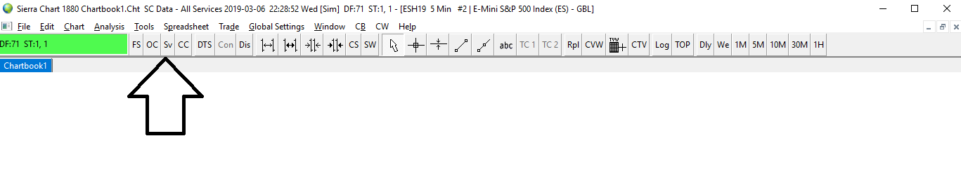
- Is it possible to show full names of the main top interface panel?
Thanks,
- P11
To my knowledge, you cannot have the full names of the toolbar keys to display at all time, these act merely as shortcuts for crucial features on Sierra Chart. However, if you hover your mouse over one of these respective shortcuts, it will display the full name of that shortcut.
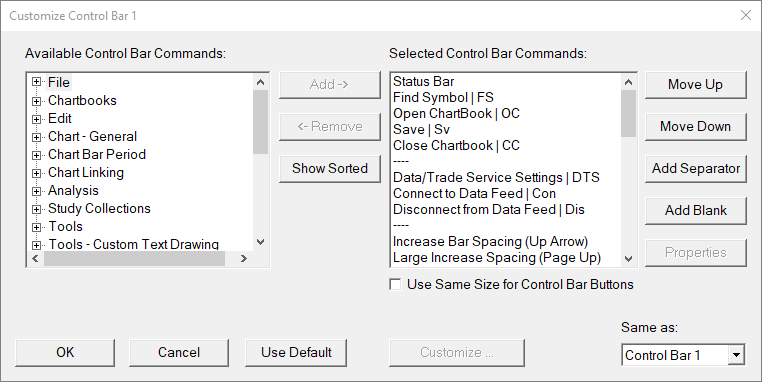
If you’d like you can also customize this toolbar by right-clicking within the toolbar and selecting Customize Control Bar 1. You can mix and match what features you’d like to add to your toolbar, rearrange its location, or even add new toolbars.
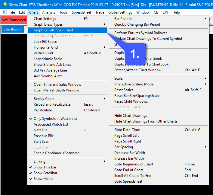
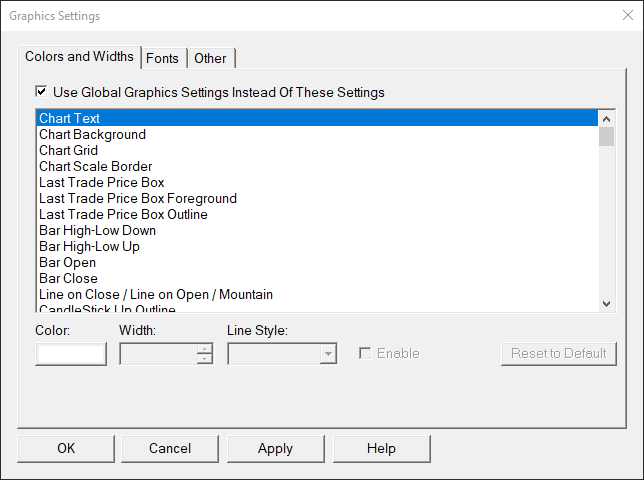
As for the topic title of your question, in reference to customizing/changing the fonts and colors of DOMS and Charts, this can be found by navigating to 1. Chart > Graphics Settings - Charts as shown below.
As you can see just from the small portion shown, there are a TON of different customization options regarding colors, widths, and fonts found within graphics settings. Simply highlight the feature you would like to customize the color of, then select its color, width, or line style in the buttom of the panel.
If you’d like to customize fonts, you can do so by activating the fonts type found at the top.
I hope you found this helpful.
Thanks,
Jake
Optimus Futures Support 
@Mod-JakeM ,
Perfect. Very helpful hints.
Also, Is possible to change the fonts on the studies themselves? Like retracements, etc?
Thanks!
@Project11 Sure, changing the fonts of studies is possible! This will require each study to be customized individually though.
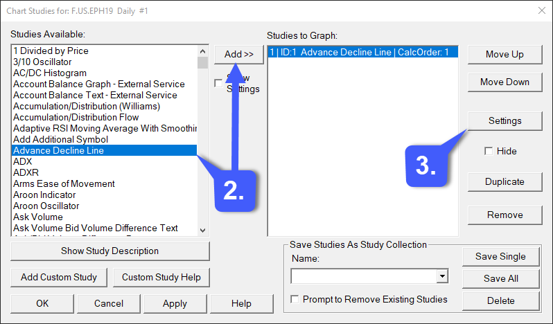
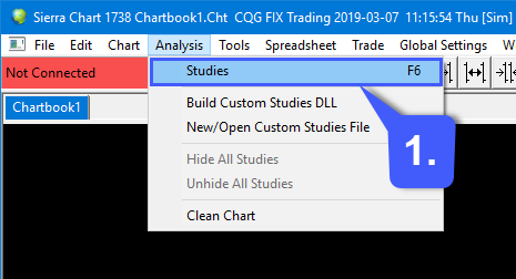
You can customize these settings by heading over to 1. Analysis > Studies (or the F6 key as a shortcut).
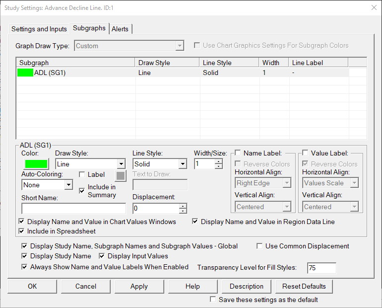
2. From there add the study you would like to display on your chart. Select the study, then press the Add button (If a study has text attached to it, you’ll be able to customize the font color. Otherwise, you can customize line colors, width, etc.) We’ve added an AD line study to our chart.
3. Once the study has been added to the Studies to Graph column, left click the Settings button on the righthand side of the screen. You can also enable the Show Settings checkbox before you add the study, which would immediately pull up this same settings window once you press the Add button.
Once within settings, you can mix and match customization options as needed (Each study will be different). Once done, click the Apply button > OK > Apply within Chart Studies > and finally OK to back out to your chart.
Thanks @Mod-JakeM ,
Terrific stuff. Not only can one customize the global settings for drawing studies but one
can also customize each study per each chart display? Wow, bravo Sierra Chart.
It’s going to be a long spring of having fun with Sierra Chart just customizing it 
Cheers,