Market Profile, Volume Analysis, and Volume Profile AMA (Ask Me Anything)

@autobahn, if I were to add a few things to my current Footprint chart, what would you recommend? In terms of analyzing price action and order flow.

I tend to lean toward simplicity but also know that things like VPOC, overnight high and low, etc, are beneficial to look at.

I’d love to see an example of your charts within Optimus if you’d be open to sharing!

How to identify areas of potential absorption in the market using DOM Surface.

When we look at order flow on the Footprint chart, we can see where active buying and selling is happening.

Today, 3/26/21, at roughly 7:35 AM, there was aggressive selling at the 3924.00 to 3925.00 level. We can see this by looking at the dark red bars accompanied by large sell quantities that hit the bid (indicated by arrows).

When we are watching order flow we can see where the bids or offers are reloading. This just means that if someone is bidding for 100 contracts and they get filled (sellers hitting the bid), the buyer will add more contracts at the same price absorbing all the sell orders.

Here’s a quick 2 minute video from today showing this exact spot:

While we cannot predict when or where this will happen, the DOM Surface can give us an idea where resting liquidity is in the market (big bids or offers off the market).

#1 - We start to see buyers adding bids indicated by the bar turning darker.
#2 - As price gets closer to the 3924.00 level, the bar turns even darker showing additional interest in buying that price from participants.
Between #2 and #3 - The big red circles between these two points show aggressive sellers hitting the bid in the 3924.00 area.
#3 - Sellers took up all the liquidity there leaving that area with “normal” size liquidity.

What happened here is that price started coming down to the 3924.00 level. When that happened, buyers started bidding at 3924.00, potentially indicating support from buyers.

Price came down and sellers aggressively sold that level.

Because there were more contracts willing to be bought than sold at that level, sellers gave up and price retraced 2-3 points.

Although that level ended up not holding up (sellers eventually brought price below this area), leading up to it the evidence of big liquidity allowed for a spot to lean on if a long trade was in order.

Furthermore, if we see liquidity like this followed up by heavy volume, it can be logical to assume that there may potentially be a significant move in either direction.

Price could rally if sellers give up and puke their position.

Price could sell off if the buyers are overwhelmed and cannot fend off the sellers, leaving the buyers to puke their position if price goes too low.

This information can be extremely useful when combined with your trading plan and overall outlook on the market. It provides insight on where the buyers and sellers are and also where they may have taken a big position.

There is a substantial risk of loss in futures trading. Past performance is not indicative of future results. The figures here represent an opinion. The placement of contingent orders by you or broker, or trading advisor, such as a “stop-loss” or “stop-limit” order, will not necessarily limit your losses to the intended amounts, since market conditions may make it impossible to execute such orders. Please conduct your own due diligence if Futures are an appropriate instrument for you.

1 Like

Trying to make the move from computer trader to human trader, I agree that the fewer things to watch, the better. I like to use a volume heat map - this makes it easy to identify the exact nodes where there is high volume within a given region.

Consider a consolidation range breakout:

The first step is to identify a consolidation range with the required bar range (in ticks) and volume. The best consolidation ranges tend to form a bell shaped volume distribution with positive delta at the top and negative delta at the bottom:

This is volume shown as a heatmap; darker colours being more volume traded and orange being the highest volume traded. I’m showing the heatmap progress over time, so imagine that the chart ends where the heatmap ends and you can’t see what is coming. At some point price will break from the consolidation range, but there is nothing in the heatmap to indicate this is happening yet:

The heatmap is relative to the region selected so will change over time. You can see the high amount of volume required for the bull break.

As the bull break stalls and price moves back below the high volume node, stops were trigged and price fell rapidly back to VPOC:

As time progresses, another high volume node appears and price moves away in the opposite direction. If this were a retest of the bull break, price would be expected to move higher from the high volume node, not lower:

Following the breakout, the highest volume node indicates a potential take profit area:

Here is how the failed bull break looks on a footprint chart. The push into resistance was very aggressive and happened almost instantly. Note how there was nothing traded at the bid for 4 consecutive ticks. Due to speed, this is likely algo action. At resistance, 136 contracts were traded to break through resistance and 87 contracts were absorbed to keep price from falling back. The 136 contracts traded at the offer is likely to be active buying and not stops - if it were stops they would have triggered at the previous bar.

When price retraces 2 ticks below the high volume node, stops are triggered downward; you can tell they are stops (or an algo) because they happen so quickly there is no time for any trades at the offer. It is only when price falls back to the VPOC that price is held and active buying resumes:


The gold bars above and blue bars below indicate L2 depth. Red/Green numbers on top of each bar represent +/- delta. White number above represents volume traded. Diagonal imbalance is highlighted within the footprint.

2 Likes

This is great! I’m heading back to my computer now to dig in. Thanks for the detail!

1 Like

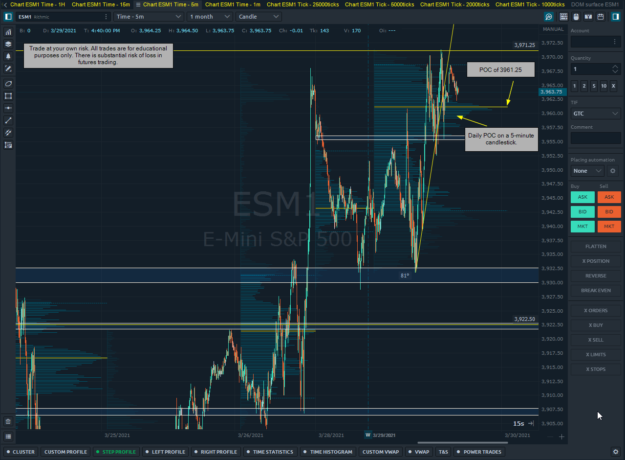
A quick look at the POC & VPOC.

POC (Point of Control) is defined as “the price level at which the heaviest volumes were traded.” By placing volume on a price axis, we can see where the most contracts traded during a specified time frame.

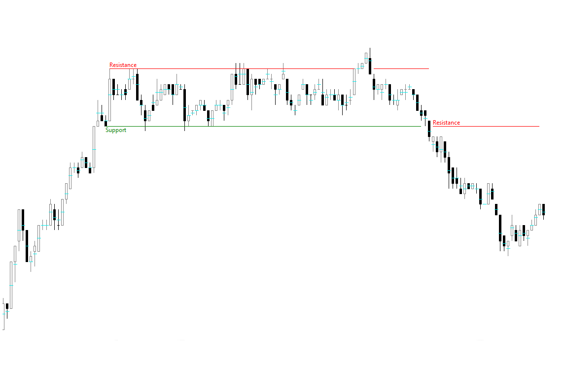
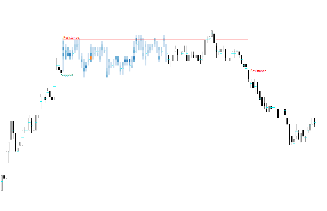
In the below chart, we are looking at 5-minute candles with a daily POC.

The daily range is highlighted here:

The horizontal volume bars are a measure of how many contracts traded at that price during that time-frame.

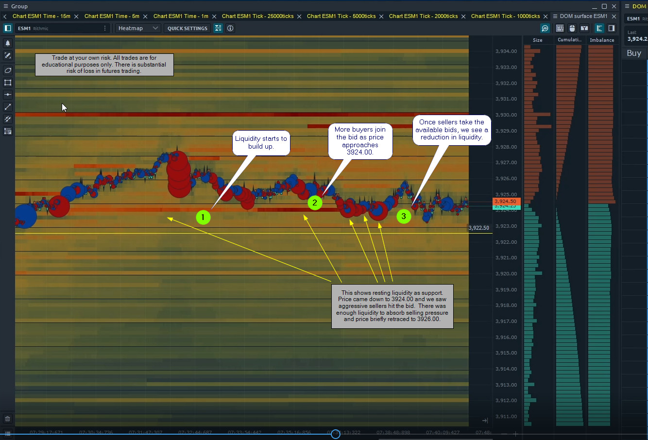
Normally, we are custom to seeing volume on a time-scale rather than a price-scale. What we can do with this information is see what prices had the most liquidity.

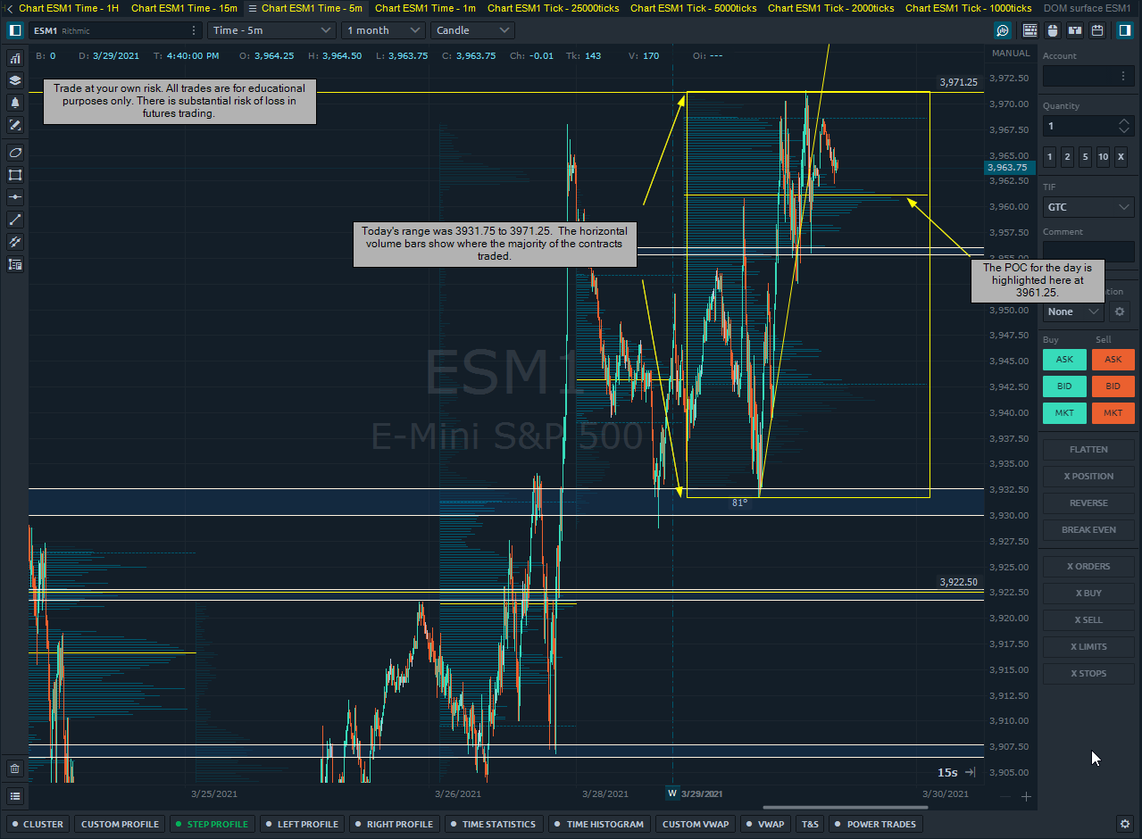
By identifying this we can then look at our Footprint chart to see if there was a bias towards sellers or buyers.

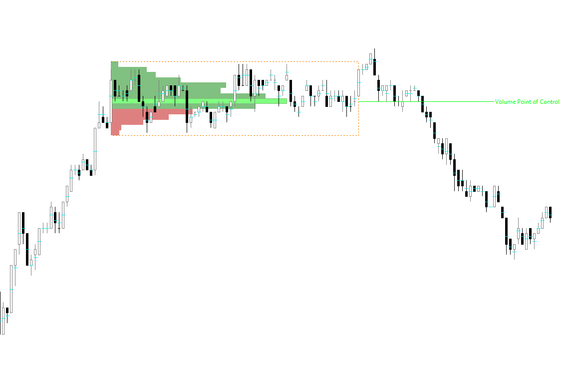
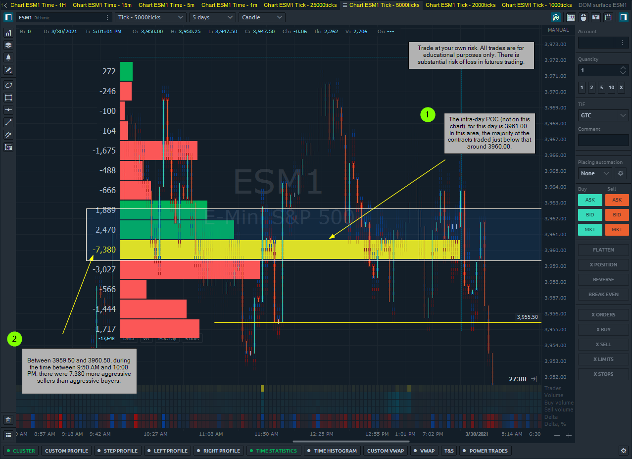
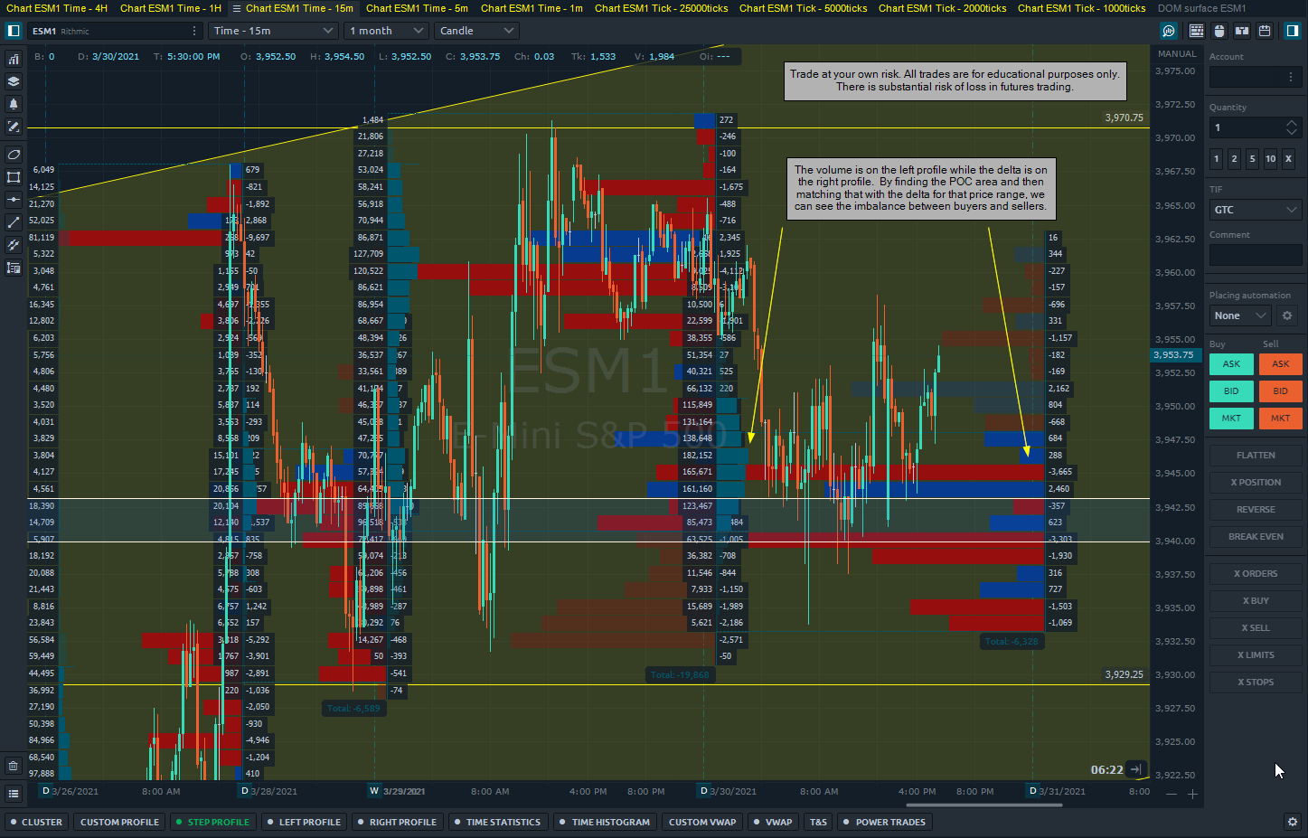
I’m particularly interested in the POC for today. Since volume is recorded on a price-scale, we can determine where the majority of the contracts traded during the day based on price.

The market opened and traded to the lows, then after 9:40 AM, moved up toward the POC. I’ve highlighted the price range I’m interested in.

This means that there were no volume bars printed in this area as price hadn’t traded there yet. Therefore, the majority of the volume today traded at 3961.25.

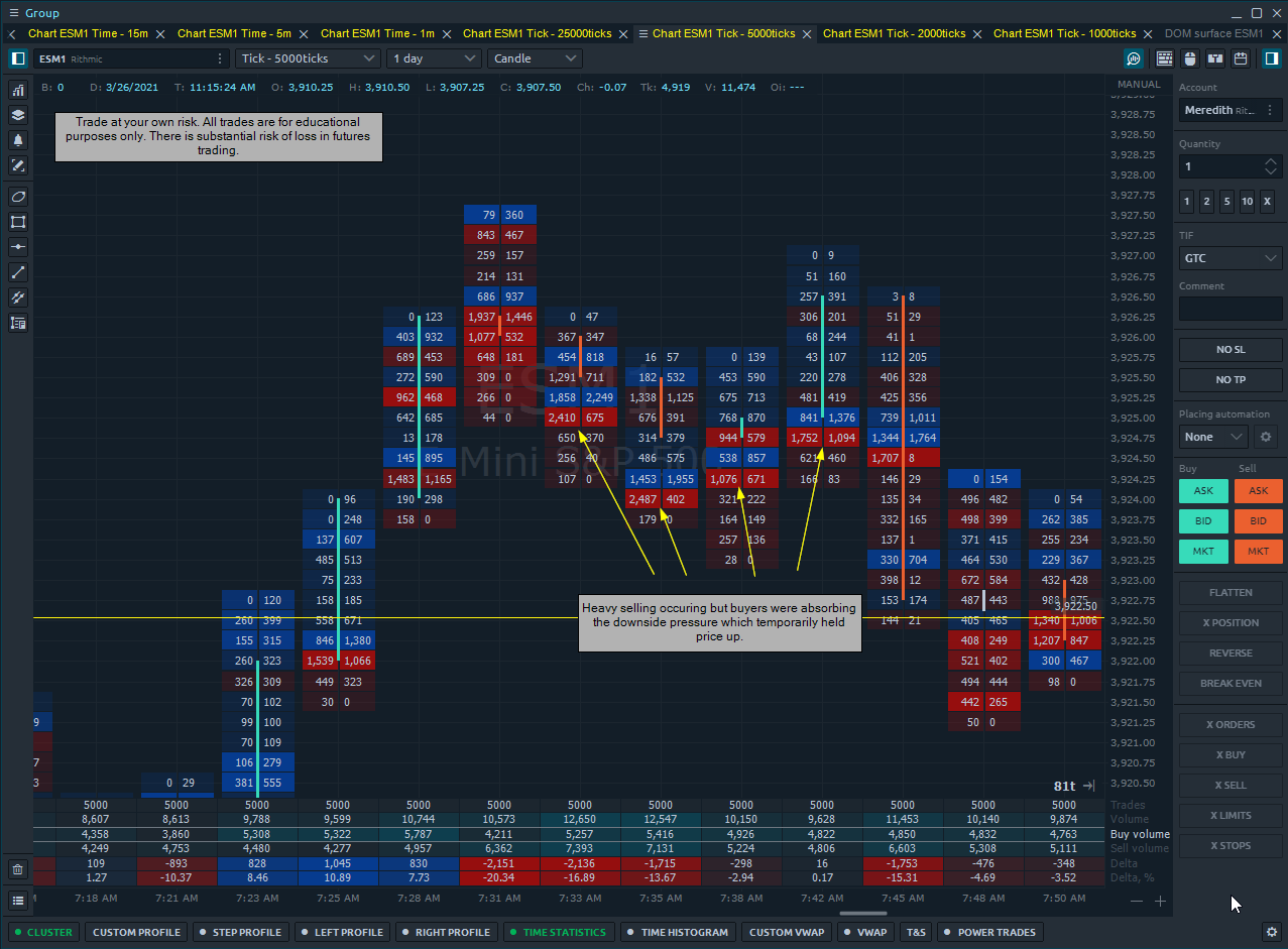
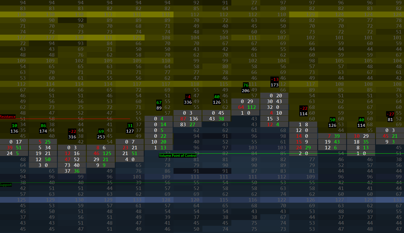
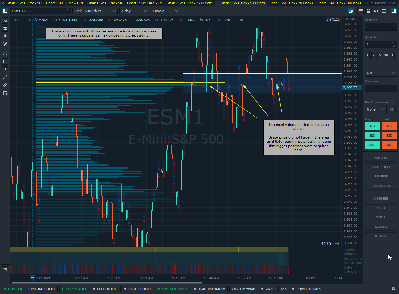
Now that we have where the majority of the volume traded in reference to price, we want to look at the imbalance between buyers and sellers in that area.

Let’s find this data on the same chart to quickly find if there was an imbalance there.

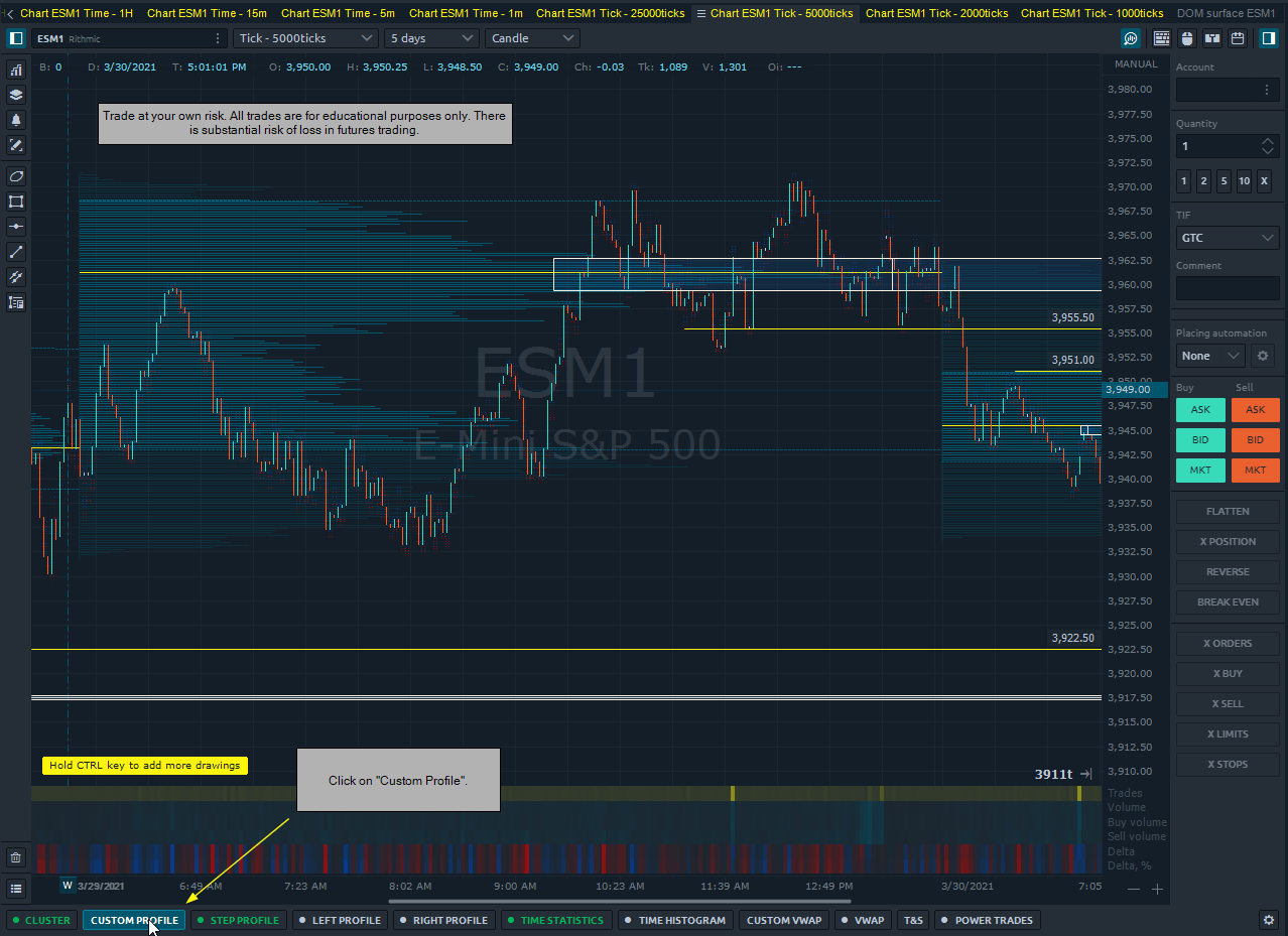
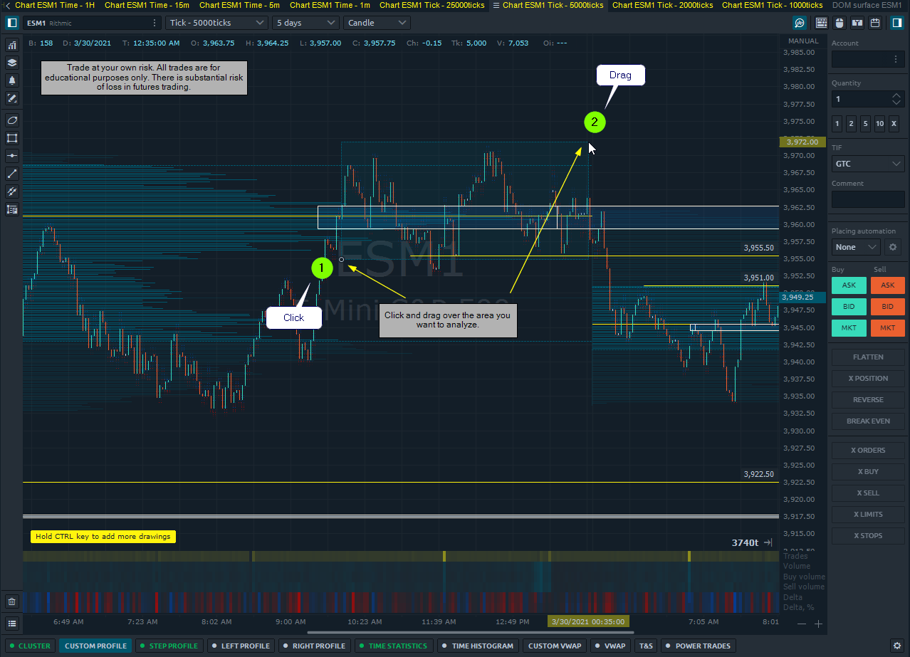
Click on “Custom Profile” on the volume analysis toolbar:

Click and drag over the area you want to analyze:

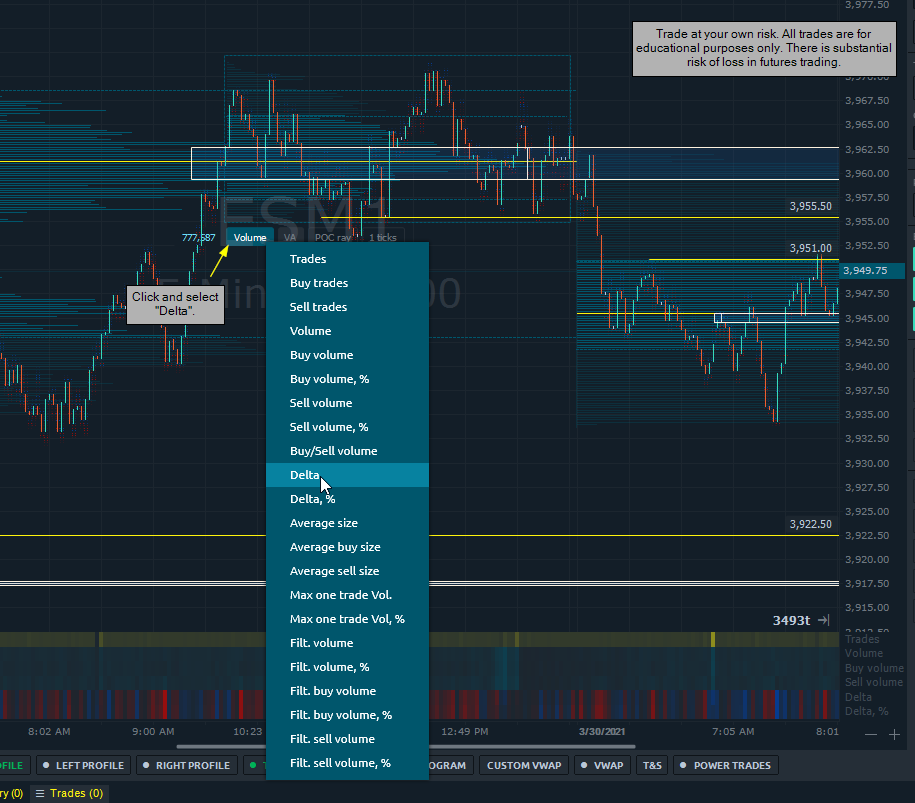
Click where it says “Volume” then change the selection to “Delta”.
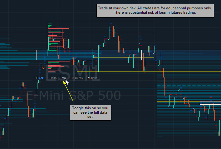
Click on “VA”.

Change to 5 ticks.

image

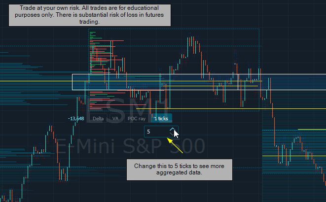
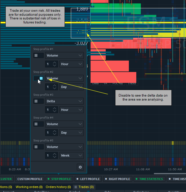
If you have the Step Profile volume enabled, you will have to disable that briefly to fully see the delta volume profile we just created.

Now we can see that there is a delta number assigned to the horizontal bars. This means that for the time range in our area (roughly 9:50 am to 10:00 pm), there were 7,320 more aggressive sellers than aggressive buyers. Specifically between the prices of 3959.50 and 3960.50.

To circle back, the reason I want to narrow down my data is that I know this is the area that traded the most contracts for that trading day. We got this from finding the POC above.

This is important to know as it provides us with a look into the bias of the majority of traders.

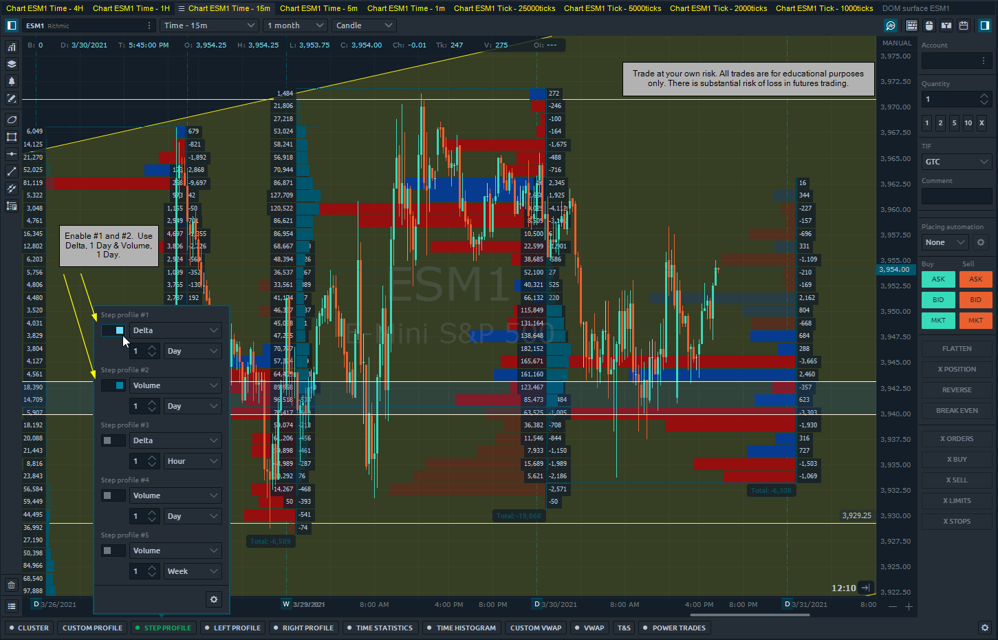
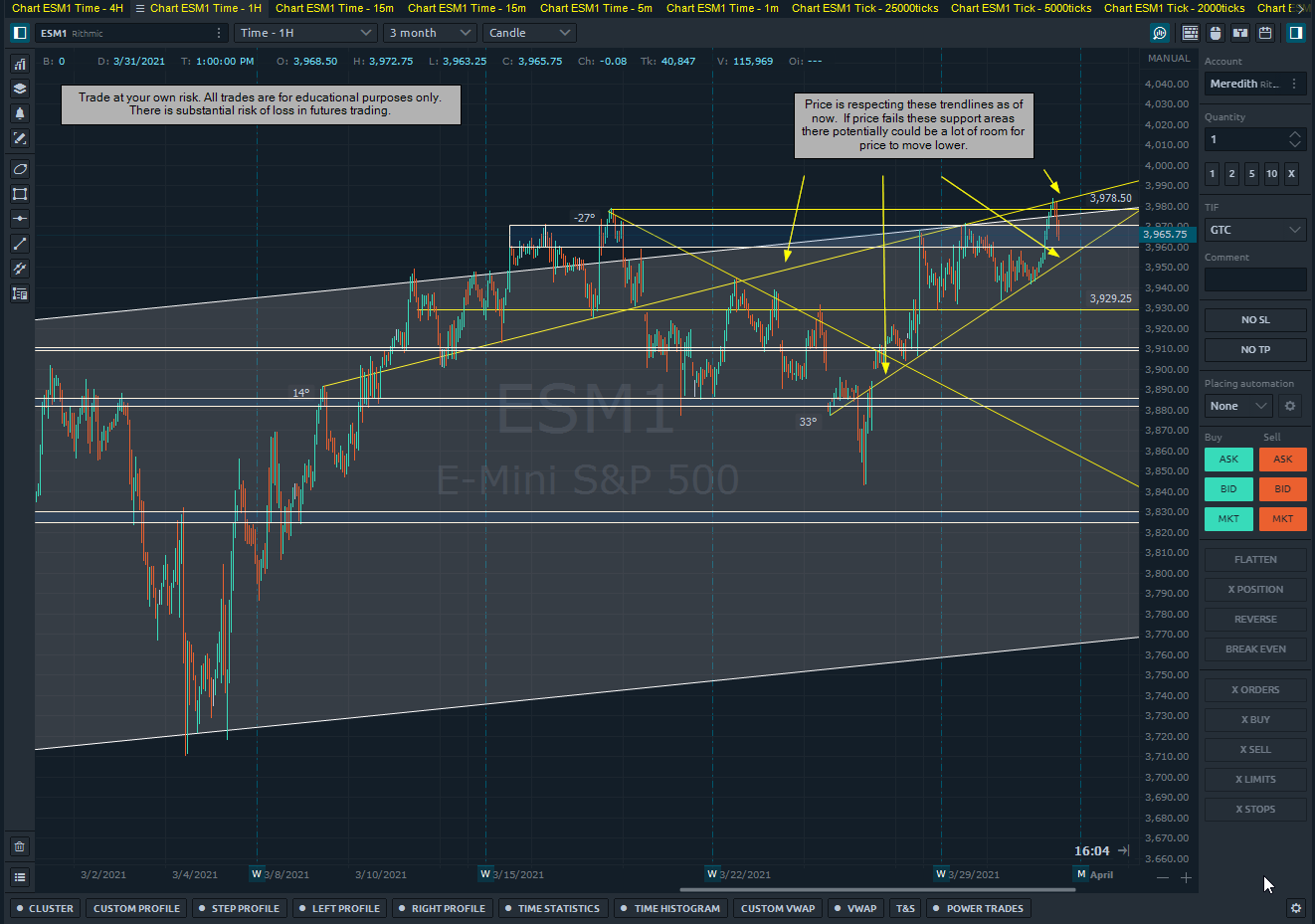
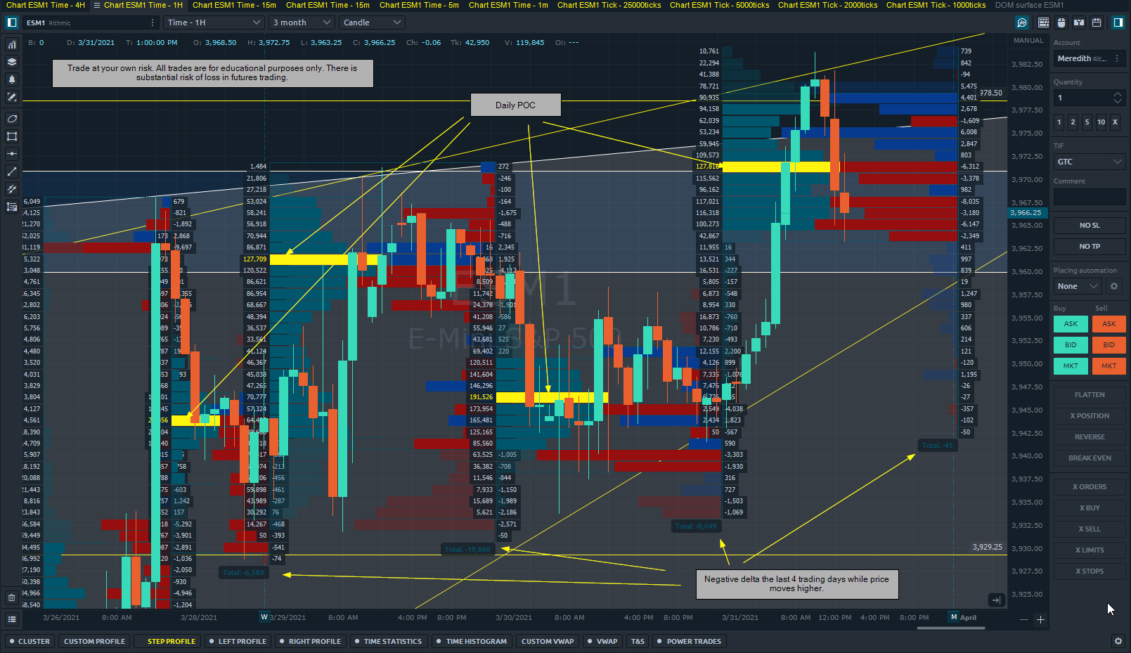
We can add this to our candlestick charts as well. I’m going to use my 15 min chart for this.

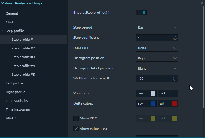
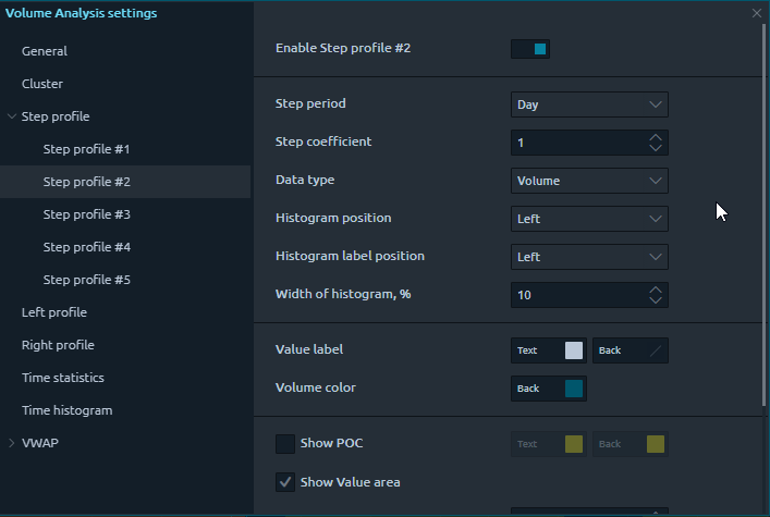
Click on “Step Profile” on the volume analytics toolbar.

Then click on the gear icon and refer to these settings to adjust accordingly:

Now we can see the chart with price, delta, and volume. Sorted by time (intra-day) as well as price.

Look at the totals of the delta for each day, these have been negative the last 3 sessions for the ES mini futures. This is relevant information because it tells us what the overall sentiment is.

There is a substantial risk of loss in futures trading. Past performance is not indicative of future results. The figures here represent an opinion. The placement of contingent orders by you or broker, or trading advisor, such as a “stop-loss” or “stop-limit” order, will not necessarily limit your losses to the intended amounts, since market conditions may make it impossible to execute such orders. Please conduct your own due diligence if Futures are an appropriate instrument for you.

1 Like

Yesterday we were able to take a look at the intra-day POC and overlay the delta based on price rather than time.

This showed us that the majority of the volume around the POC was heavily weighted toward aggressive selling.

Today, the market opened and was trading on lighter volume until price rose above 3962.50.

At this point we saw more volume come into the market and it was biased toward aggressive buying. Here’s the chart:

Price has retraced from the high of today at 3983.75 and is sitting above support at 3979.00.

We will watch how the imbalance of buying and selling plays out near these levels to find the direction.

Post session update:

Price eventually sold off from the 3978.50 levels and closed at 3964.00. I’m referencing technical analysis to then integrate order flow data. Then we will be able to develop a plan for tomorrow.

Let’s look at a longer time frame with volume and delta profiles.

Here is the hourly chart with the past 4 days. It shows the volume and delta based on price. The last 4 days have all had a negative delta despite price moving up to resistance. Today, 3/31, we saw more buying than selling in the morning. The aggressive sellers came into the market near the closing bell which returned price to the 3964.00 level.

There’s a few things I’m going to be watching before the open tomorrow:

  1. If price opens below the POC from today, I would expect the market to continue it’s uptrend and fill the VPOC (virgin point of control), at which point I’ll be watching resistance levels to attract sellers.

  2. If price opens above the POC, the VPOC would have to be filled as the market comes down (if it doesn’t keep it open through tomorrow) and significantly test support near the 3970.75 area. This level also conincides with the lower trendline.

If the latter scenario plays out, I’ll be watching for aggressive sellers to come in and drive price below that area, which would make the target 3957.00, 3930.00 and 3904.00.

Here are the two scenarios I’ll be looking for tomorrow:

The other thing to note on this chart is the huge negative delta candlesticks that traded at 12:45 PM on 3/31. This showed lots of aggressive selling within 15-30 minutes, more than we’ve seen in the last 5 days at least.

Based on the price movement of the market I am inclined to think that these were buyers that predicted an upside breakout as price was moving up this morning. As price came back down near the close many positions most likely got stopped out.

Where does this leave us for tomorrow? Well potentially, as those positions exited there was a new wave of buyers that saw value with price coming back to support, hoping it will continue the uptrend and move higher.

These also could have been momentum sellers to the short side, speculating the new highs were a false breakout and price will break the lower trendline and sell-off. This narrative plays out well with the negative delta we’ve seen over the last 4 days. The idea that the majority of players are aggressive sellers and more inclined to hit the bid on a selloff rather than lift the offer.

There is a substantial risk of loss in futures trading. Past performance is not indicative of future results. The figures here represent an opinion. The placement of contingent orders by you or broker, or trading advisor, such as a “stop-loss” or “stop-limit” order, will not necessarily limit your losses to the intended amounts, since market conditions may make it impossible to execute such orders. Please conduct your own due diligence if Futures are an appropriate instrument for you.

2 Likes

Delta Rotation

I’d like to hear your outlook on the Delta Rotation indicator in Optimus Flow. I was watching some videos on charts and order flow when I came across this. As mentioned before, I started trading by just watching the DOM and a chart. We didn’t have indicators like this back then and I want to learn about the most relevant/helpful tools regarding order flow so your feedback is welcomed!

So, back to Delta Rotation.

Yesterday I was looking at how this indicator works with certain patterns over time. I noticed on the 5-minute chart there were two instances on 3/29 that stood out to me. Here’s the chart:

I’ve added the VWAP and kept the Delta Rotation settings standard, except for removing the box.

On #1, we see the Delta Rotation down for 4 bars in a row. During that time price was bottoming and did not make lower lows on the 5-minute candlestick.

Here is the Footprint Chart of that exact time-frame:

My analysis of this, and I actually saw this in real-time, was sellers were aggressive at the lows and couldn’t push price lower. This was setting up to potentially trap the sellers if price moved against them and fuel a rally.

Each time price came down near the lows, we saw consistent aggressive selling, but they couldn’t even make new lows by 1-2 ticks. It was actually higher lows by 1 tick on each push-down.

This analysis is still very speculative and open to interpretation. That’s fine and still very helpful to know what the sellers and buyers are doing.

The Delta Rotation however is down 4 bars in a row and going lower on each one.

This happens again at #2 on the first chart.

I’ve looked online to get an explanation and haven’t found anything with substance, so thought it would be a good topic here on the Market Profile thread.

What is Delta Rotation? How can we use it with our Footprint chart to improve our decision-making and execution? @Mod-JakeM @Mod-MattZ @autobahn

Thank you!

There is a substantial risk of loss in futures trading. Past performance is not indicative of future results. The figures here represent an opinion. The placement of contingent orders by you or broker, or trading advisor, such as a “stop-loss” or “stop-limit” order, will not necessarily limit your losses to the intended amounts, since market conditions may make it impossible to execute such orders. Please conduct your own due diligence if Futures are an appropriate instrument for you.

1 Like

I think I found the partial answer, but still not adding up.

I pulled up the Delta Rotation and also the Delta, I noticed that the Delta Rotation is adding up consecutive Delta bars then creating a new sequence when the Delta is in the opposite direction.

However, there are times where it doesn’t appear to be adding to the last bar even if the Delta is in the same direction as the previous one.

What do you think?

There is a substantial risk of loss in futures trading. Past performance is not indicative of future results. The figures here represent an opinion. The placement of contingent orders by you or broker, or trading advisor, such as a “stop-loss” or “stop-limit” order, will not necessarily limit your losses to the intended amounts, since market conditions may make it impossible to execute such orders. Please conduct your own due diligence if Futures are an appropriate instrument for you.

1 Like

Looks like delta rotation is cumulative delta that resets on each new rotation.

A ‘rotation’ appears to be determined by price and not delta.

If price is choppily moving sideways, delta rotation won’t show much. But in a traditional trending market where there are clear pullbacks, it should make more sense what it is doing.

I don’t know the exact formula Optimus Flow uses to calculate a rotation. It may be simple ‘is the candle green’ or it may be based on a more complex formula that determines swing high/swing low points.

I have my own indicator that shows delta over a region, but I’m responsible for drawing the region(s) I’m interested in.

PS I sent you a connection on LinkedIn so we can discuss ideas for algos and automation. I can’t see how to send a personal message on this forum.

1 Like

I can ask the developers which formula they used.

Matt

1 Like

We have disabled that feature to protect the privacy of our users, and avoid solicitations by third party vendors.

Matt

2 Likes

I guessed that would be the case, it makes sense.

Think I see it, did you go to Contra Costa?

No, that isn’t me. I’m from the UK. I sent a message with the request.

I am not seeing the invite, do you want to send again or paste your profile here?

Thanks so much.

I want to keep the identity and profile confidential.
Please email me each of you with a request and I’ll make the intro.
Ideally, you keep interacting here to create content for our users.
Matt

1 Like

Gotcha thanks Matt. Will do and have a great Easter!

1 Like

The same to you and have a great weekend.
Matt

1 Like

Thanks, we are connected now.

1 Like

Absorption vs. Aggressive Selling. 4/7 Wednesday Market Behavior.

On the S&P thread for the last few days we have pointed out that the market is seeing much more aggressive selling than buying, yet price is unable to break any significant resistance.

This has been attributed to the large quantity of passive buyers absorbing selling that comes into the market, preventing price from moving below support.

The question I’m asking is how long can passive buyers hold this market up? What do participants need to see for price to move lower?

It’s hard to see the buyers continuing to hold up such massive selling power. If the aggressive selling continues in the way it has, price potentially can move much lower, forcing the longs out of their position.

However, any short position that is taken will be closely watched.

2 Likes